Are you ready? Colors of the year 2023 are here! And they are fun nd exciting! Last year’s color trends were earthy tones and muted, sometimes silvery, shades of green that reflected a back-to-nature theme. This year’s trendy colors are also inspired by nature, but instead of magical trees and forest think sunsets over a sprawling desert landscape exuding peace and calm with a touch of excitement. Designers from all paint brands and interior design magazines are ready to unveil their latest picks!
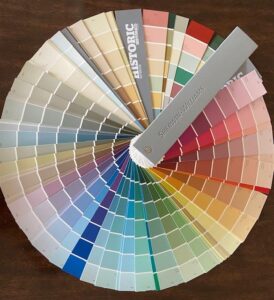
NOTE: Due to some materials being proprietary, please click on the included links for a peak at each color.
SHERWIN WILLIAMS
As color of the year for Sherwin-Williams, their designers have chosen REDEND POINT SW 9081. According to their website Redend Point is a “ground blush-beige that blends the energies of playful pinks and steady earth tones.” They also describe it as “a warm neutral that can work equally well in a creativity-inspiring office as well as a cozy reading nook.” Because it is nature-based it pairs well with last year’s color of year, Evergreen Fog.
BETTER HOMES AND GARDENS
The Color of the Year 2023 from Better Homes and Gardens is very similar to Sherwin-Williams. It is Canyon Ridge and is available only at WalMart. BHG calls it “a subtle spin on terracotta” and likens it more to “sun-baked clay than cayenne papper.” Design director at BHG, Jessica Thomas, pairs this color with bright blue accessories – cobalt blue for a modern look, denim blue for a more casual feel and navy blue for a traditional look.
BEHR
Behr’s pick for 2023 is a creamy shade of white, Blank Canvas, that goes with practically everything. Vice-president of color and creative services for Behr describes it this way, “This white easily harmonizes with a wide range of hues, including neutrals, earth tones and pastels for a charming and cozy appeal.” This color of the year is all about relaxation, creativity and concentration.
PANTONE
Pantone Color Institute is not a company that produces paints, but rather a consulting service within Pantone that forecasts global color trends and advises companies on color in brand identity. They have, however, declared their Color of the Year as Digital Lavender. This a another soothing and relaxing color that can work and walls or in accessories for your rooms.
Some general recommendations from Pantone include vibrant primary colors in red, yellow and blue. Paint your walls in white or a creamy and add accessories in these primary colors for a bold, dramatic colors. Royal blue will create a pleasing balance with the two warm colors. Soothing nature inspired hues such as soft, muted greens, a cool mid-tone blue to mimic the feeling of serene lake waters or a deep teal for a little drama. Finally, familiar neutrals like gray, brown/beige, and greige remain popular. Even darker grays paired with a creamy white convey sophistication and relaxation. For more information about Pantone go to pantone.com.
INTERIOR AND EXTERIOR PAINTING
October/November are great months to do your exterior painting. It is cool, but not so cold as to affect the viscosity of the paint. Once the end of November rolls around and daytime temperatures are low, it is better to concentrate on painting the interior of your home. If you want the interior of your home ready for the Thanksgiving or Christmas holidays, its time to call ColaTown Painting and get on the schedule!
Call Britt now – 803-603-6486 – for your free, no-obligation estimate.