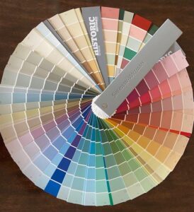
WOW! It’s almost 2022 and the colors of the year are here! Actually the colors of the year come from several different color design leaders, so we are here to give you a preview from Sherwin-Williams, Behr and Pantone. You’re gonna love these!

Colors of the Year are here!
SHERWIN-WILLIAMS
The 2022 Color of the Year for SW is a tranquil, gray-green called Evergreen Fog (SW9130). Director of Color marketing, Sue Wadden describes it as, “…a sophisticated wash of color for spaces that crave a subtle yet stunning statement shade.” She goes on to say that it is the perfect, modern color for interiors and exteriors and recommends that it be paired with warm, organic neutrals that celebrate the simplistic beauty of nature. Specifically those colors are Uber Umber (SW9107), Woven Wicker (SW9104) and Bakelite Gold (SW6368). Get a look at these beautiful colors – click here or visit your nearest Sherwin-Williams store. You won’t be disappointed.
BEHR’S
Behr’s pick for 2022 color of the year is Breezeway. Softer in tone than Evergreen Fog, it is described as “sea glass green” and conveys a tranquil, relaxing feeling. This silvery green shade is also perfect for a front door.
“A new year brings the opportunity to embrace a sense of renewal and pursue untapped passions,” said Erika Woelfel, vice president of color and creative services at Behr Paint Company, in a press release. “Whether it’s lacing up our hiking boots, or breaking out the gardening tools, Breezeway inspires us to fully embrace the hobbies or adventures, both near and far, that excite us. We look forward to a color that welcomes a hopeful sense of renewal, restoration, and healing.”
To check out Breezeway and the whole palette of colors, just follow this link.
PANTONE
Pantone Color Institute is not a company that produces paints, but rather a consulting service within Pantone that forecasts global color trends and advises companies on color in brand identity. They have not declared a “color of the year” as yet, but has predicted colors you can expect to see everywhere in 2022. So, if green is not your thing, consider these exciting options.
Vibrant primary colors in red, yellow and blue. Paint your walls in white or a creamy and add accessories in these primary colors for a bold, dramatic colors. Royal blue will create a pleasing balance with the two warm colors. Soothing nature inspired hues such as soft, muted greens, a cool mid-tone blue to mimic the feeling of serene lake waters or a deep teal for a little drama. Finally, familiar neutrals like gray, brown/beige, and greige remain popular. Even darker grays paired with a creamy white convey sophistication and relaxation. For more information about Pantone go to pantone.com.
October/November are great months to do your exterior painting. It is cool, but not so cold as to affect the viscosity of the paint. Once the end of November rolls around and daytime temperatures are low, it is better to concentrate on painting the interior of your home. If you want the interior of your home ready for the Thanksgiving or Christmas holidays, its time to call ColaTown Painting and get on the schedule!
Call Britt now – 803-603-6486 – for your free, no-obligation estimate.


